Summer Days
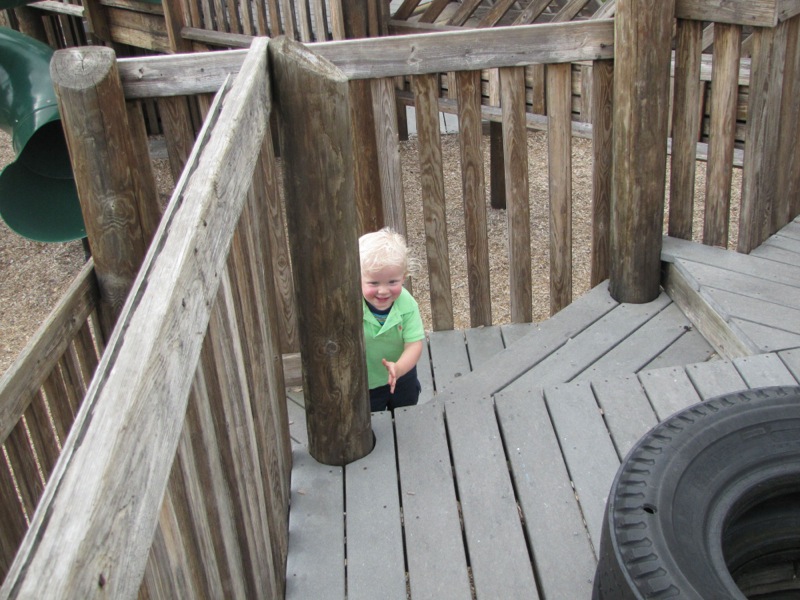
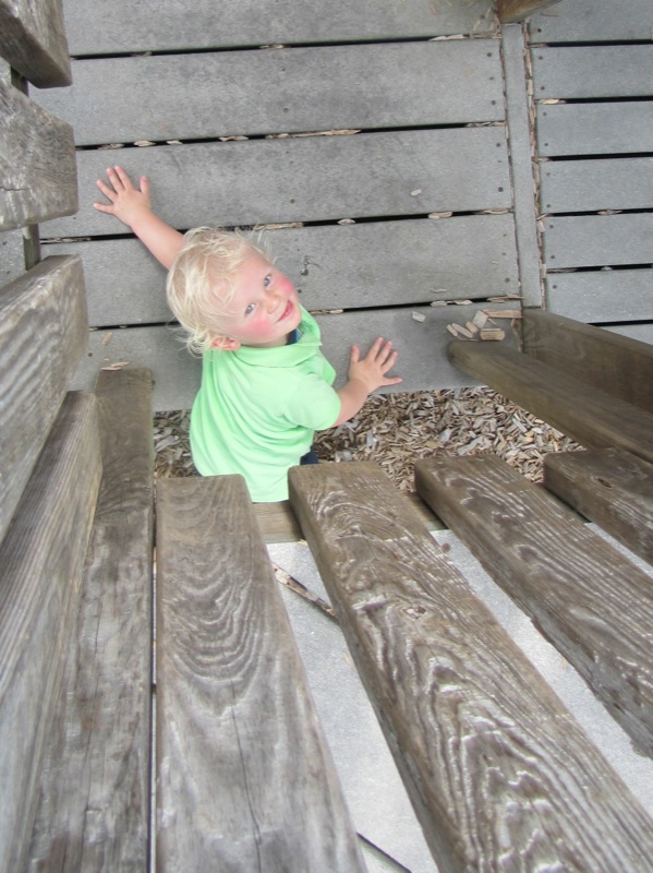
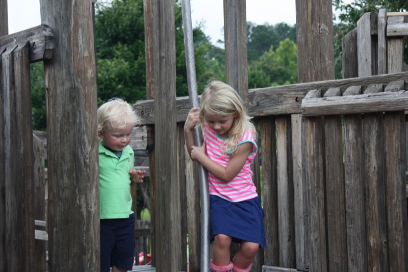
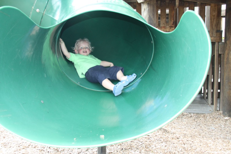
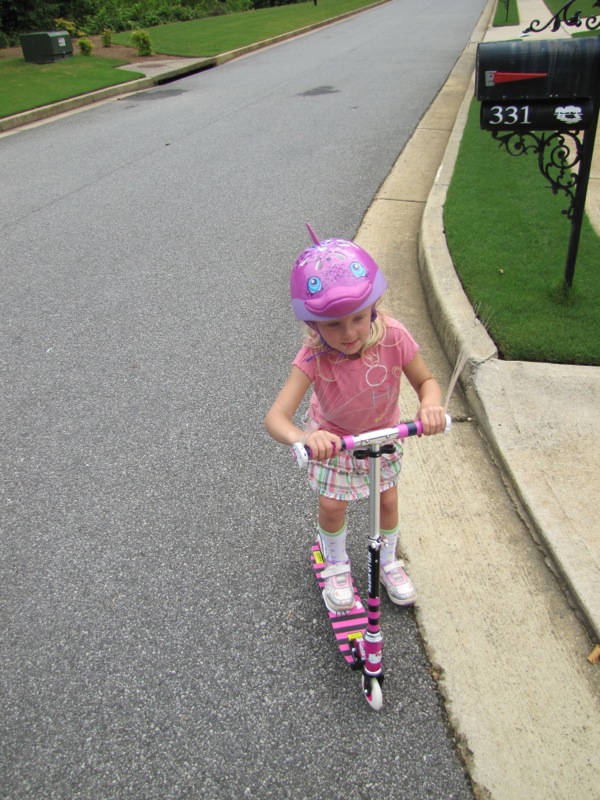
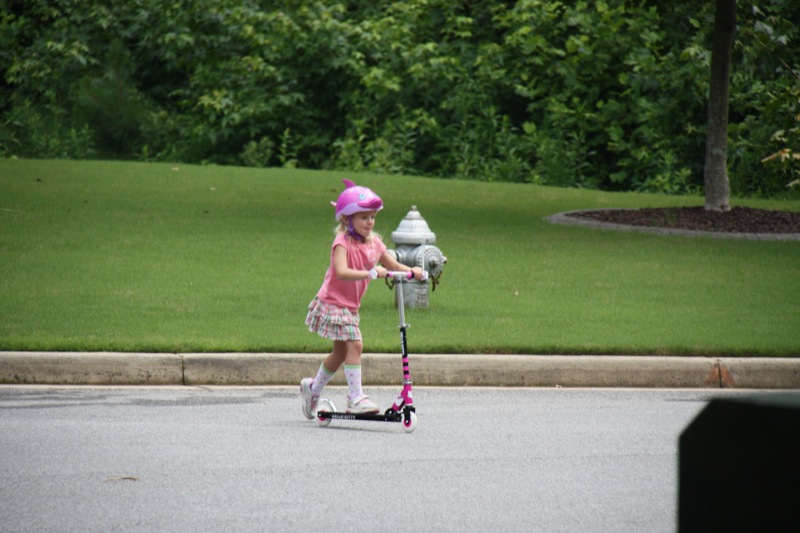
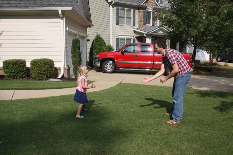
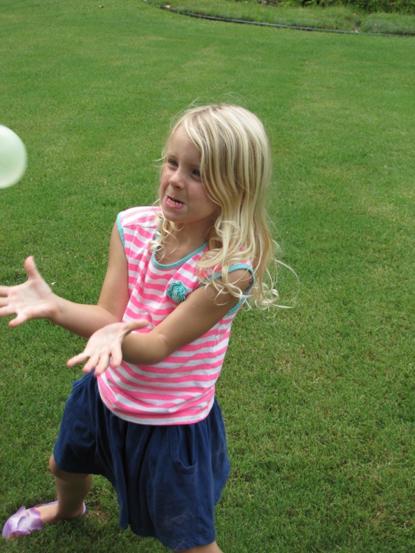
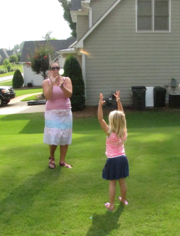
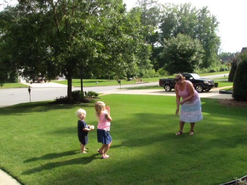
The kids are having a fun time in the summer sun. Â After a yummy breakfast, we took the kids to a nearby park with a fantastic playground. Â Penny quickly made friends while Teddy explored and hit the slides. Â Later in the day, after getting a new helmet and a quick lunch trip, Penny hit the road in her new scooter Lisa gave her for her birthday. Â We also played with water balloons out in the front yard in the late afternoon. Â SUMMER FUN!


The content smells like it was scraped from the bottom of a trash can.
This site is so ugly it could make a mirror crack.
This website is a glitchy nightmare that haunts my cursor.
This site is proof that not everyone should have access to a computer.
The writing is so awful it could ruin a good mood in seconds.
The color scheme screams I hate my eyes and everyone else’s too.
I’ve seen better layouts in a dumpster fire.
This website looks like a toddler smeared ketchup on a broken calculator and called it art.
The content is as useful as a chocolate teapot.
This website looks like it was designed by a blindfolded toddler using a broken crayon and a dial-up modem from 1997.
The designer clearly thinks random flashing ads are peak design.
The content is a dull parade of recycled garbage.
This content is so dull it could put a caffeine addict to sleep.
The designer’s skills are a tragedy in three acts: ugly, slow, and broken.
The content is so pointless it makes a blank page look profound.
The designer’s creativity is a flatline on life support.
The content is a steaming pile of incoherent gibberish.
This site is a black hole where good taste goes to die.
This site crashes more often than a toddler on a sugar high.
The writing is so terrible it could make a thesaurus weep.
Navigating this site is like wading through a swamp of expired mayonnaise—slow, disgusting, and utterly pointless.
Whoever made this clearly thinks Comic Sans is a personality trait.
The designer’s idea of modern is stuck in 1998.
The designer’s idea of creativity must be stealing from a 90s Geocities page.
The designer’s work is an insult to screens everywhere.
The articles here are dumber than a bag of rusty hammers.
The designer must have been asleep during the entire process.
I’ve seen more creativity and functionality in a used napkin than this pathetic excuse for a webpage.
The designer must have thought neon green on pink was a good idea.
This website is a crime against the internet and humanity.
This website is a masterclass in how to waste everyone’s time.
This site loads slower than a sloth on sedatives.
This site is a black hole where good taste goes to die.
The designer’s talent is a myth, like Bigfoot or good Wi-Fi.
This website looks like a toddler smeared ketchup on a broken calculator and called it art.
Whoever coded this clearly learned HTML from a cereal box and then forgot half the instructions.
The designer clearly thinks pop-ups are the key to happiness.
The designer must have learned coding from a cereal box.
This site is a glitchy disaster begging to be put out of its misery.
This website is a disaster so epic it deserves its own documentary.
The text is a snoozefest that could bore a caffeine junkie.
This website is what failure looks like in pixel form.
This website is what happens when you give a raccoon a keyboard.
This website is what happens when you give a raccoon a keyboard.
The content smells like it was scraped from the bottom of a trash can.
The color scheme screams I hate my eyes and everyone else’s too.
The designer’s skills are a tragedy in three acts: ugly, slow, and broken.
It’s so riddled with pop-ups, I thought I’d accidentally joined a circus instead of visiting a website.
This website is so bad it could crash the internet out of shame.
Whoever coded this clearly learned HTML from a cereal box and then forgot half the instructions.